Showing posts with label Ben Bezzina. Show all posts

Monday, 23 January 2012

Evaluation: Question 3

Q3: How did you use media technologies in the construction and research, planning and evaluation stages?


Here is a list of the technologies I used 
  • Cameras - These were the most important and also most expensive equipment we used, as without them we would not have been able to film anything. We only used the cameras in the production stage and filmed in 720p HD. I found the cameras easy to use as we used them in the AS year to film our thriller openings. This year I experimented with different angles and camera movements, such as moving the camera in time with the music. Also, more experimental editing prompted me to film some different kinds of shots, such as long shots of a character running, which would then be sped up/slowed down. When filming at night, we tried filming in different levels of light as we had portable spotlights with us. Filming in low light while still making sure there was enough light to be seen was quite difficult, but I think we got this right as it looked perfect on the computer & at the cinema screening.
  • Still Camera - We used still cameras to take pictures of many different things during the planning and production stages. Firstly, we took pictures of our storyboard and then used this to take pictures of little figurines to create our animatic. Click here to see our Animatic
  • Flip Cameras - I used these small handheld cameras several times throughout the year to record things quickly and easily, such as feedback from teachers and classmates.
  • Memory Cards - The 16GB memory cards we used allowed us to film hours of footage (until the camera batteries ran out)
  • External Hard Drive - We used a 500GB external HD to store all of our work. This was important as we did not always work on the same computer every lesson. It also meant that our work was safe, and no one could interfere with it. The 500GB capacity meant we could store lots of footage on the HD and not worry about deleting any we didn’t need.
  • Apple iMacs/Mac Pros - We used dual screen Mac Pros for most of the editing, as the two screens made it easy to see the different windows of Final Cut Pro easily. After the music video was finished, we used the iMacs for creating the ancillary work on Photoshop. Both types of Mac had the same software installed, but editing was easier on the Mac Pros with two screens, and using Photoshop on the iMacs was more practical and compact.
Our finished music video in Final Cut on a dual screen Mac Pro
Software:
  • Final Cut Pro - This was the most important software we used, as it allowed us to edit the footage we filmed and create the music video. Without Final Cut or a similar editing software package, we would have just had lots of separate clips. I did almost all of the editing for my group, and experimented with effects such as slowing down clips.
Here is a video of myself using Final Cut to show how we created the 'flickering' effect between the two clips, and how I changed the speed of some of the clips to convert them to slow motion.


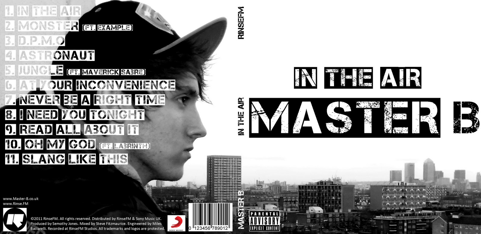
  • Photoshop - Photoshop was only used for the production of the ancillary products. I used it to manipulate an image of the artist and add text and logos. My digipack was quite a simple design, which the video below shows, in which I hide all the layers one by one so every element of the design can be seen.


  • Handbrake - Handbrake is what we used to convert video files (.mov) that had been exported from Final Cut Pro to smaller file sized .mp4 files so we could upload them to Blogger. The downside to this is the quality is significantly reduced, but on the plus side the upload time is short.
  • Fontbook - I used Fontbook to install fonts that I downloaded from the website Dafont.com so I could use them in my ancillary work.
  • iShowU - This is a screen recording program which I used to create the two videos seen above. It records everything that happens on screen and exports it as a video file. I have found it very useful in the evaluation stage to illustrate certain things that I have done on the computer.
  • Powerpoint - We used Powerpoint to create our pitch before delivering it to our teacher and the class. It is very easy to use, and enabled us to add text and images to different slides in the presentation.

Websites:
  • Blogger - Blogger is the most important website and has been used in every single stage of the process. It enabled us to document/record our research, planning, production and evaluation in a way which is easy to access and use.
  • Youtube - I used Youtube extensively in the planning and research stage to watch music videos and find examples of shots and editing techniques that I could use in our music video. It was very important and helped a lot, as their are thousands of music videos on there which can be viewed any time.
  • Vimeo - Vimeo is the site we used to view previous student work in the planning stage, and also upload our music video to at the end of the production stage.
  • Prezi - This site is useful for creating online slideshow presentations which can be embedded into other sites (such as Blogger)
  • Dafont - This website has thousands of free fonts which can be downloaded quickly and easily. This was vital for my ancillary work, as the most important feature of the front of my digipack is the title font. Luckily I was able to find a suitable font on this website.
  • QRcodeGenerator - I used this website to create a QR code image which could be scanned with any smart phone and would then link to the artist’s website for my advertisement. 


The font I used from the website Dafont.com


Thursday, 19 January 2012

Evaluation: Question 2

Q2: How effective is the combination of your main product (music video) and ancillary texts (digipack and advertisement)?

Here is a video of me addressing question two:


This image is the main image used on my digipack and advertisement. The costume/outfit makes it easy to see that it is the same person/artist as in the music video. Also the background shows an urban area, which is the same setting as most of the video.


This is the image which I used in the inside of my digipack, which looks similar to some of the scenes in the music video. 


The front of my digipack


My advertisement
I think my advertisement is eye catching and will appeal to my target audience. Also it is clear what genre of music the advert is showing just by looking at it, due to the font, colour scheme and images used. I used a greyscale effect on the images on the digipack and advertisement to make it seem darker and bleak, and look more like the music video as part of it was filmed at night, and the whole thing has a dark/grimey feel to it, which captures the feel of the track. 


The inside of my digipack
These are some screenshots from my music video showing the urban/concrete background, which creates the same feel/atmosphere as which is captured by my ancillary products.


Thursday, 12 January 2012

Evaluation: Question 1

Q1: In what does your media product use, develop or challenge forms and conventions or real media products?


A number of videos influenced us while we were planning our music video. One of these was the original video to the track. One aspect we took from the original video was the pace of editing and amount of cuts. While researching this, we tried to count the number of cuts in the original video but lost count after around 200. This made it clear to us that we would have to film A LOT of footage and also spend a lot of time on the editing, which we incorporated into our plan. 


Here is the official video for our track:


Julien seen walking next to our motif (on the wall)


The real motif for the track in the original video


The image below shows the artist performing the lyrics. You can see the body language is quite bold and aggressive, which is conventional in rap/grime videos, as the artists are usually aggressive and angry when rapping/performing.


Here is a video I created in Final Cut showing a clip from the start of the original video and a clip from the end of our video. It shows how we used the same technique of filming a tracking shot of the actor and then speeding the footage up in Final Cut Pro. In the original track this is used to introduce the character at the start of the video, and is in time with the white noise sound effect. We decided to use this technique for the final shot in our video, to make it seem as if whatever the character was running from has caught him. It follows the convention of the camera and editing being in time with the music, as it ends on the last beat of the song. I think it works well as a climax to the song, and acts as a sort of resolution to the narrative, but could also be seen as a cliffhanger. This challenges one of the conventions followed by many music videos, as most narratives do not usually have an ending.


I created the video below by downloading the original video from Youtube and importing it into Final Cut beside a sequence from our video, and then using the Image & Wireframe feature to make the clips play alongside one another. The clips show the climax of the song, and the fastest paced editing in both videos. Obviously, the original video has a greater range of shots and more cuts than ours as it was made by a professional music video directors/editors, but I think ours is still edited well and creates the same excitement and feel as the original.
Other conventions our music video follows are the use of a base track of the artist, and obvious edits to draw attention to the cuts.


Our video features both an actor and artist, which is unusual for a music video as many use the artist as an actor as well, performing the lyrics and acting as a character in the narrative. We used cross-cutting to go between the narrative and performance elements of the video. There is roughly an equal balance between the two, which is conventional in many music videos.


I think my Digipack is quite conventional as it features an image on the artist on the outside cover, but challenges the usual convention of having the artist's face on the front cover. Instead, one large image of the artist is used to cover the whole back and front cover, with the artist's name & album title on the front, in big bold font. Although some of the text for the track-listing covers some of the image, the artist's face is still clear. My Digipack also uses a simple colour scheme (which is black, white and grey) as almost all real CD covers do, avoiding vivid colours which can look tacky.


My advertisement uses the same image, font and colour scheme as the Digipack, with the addition of the red font which is used to make it stand out and catch people's eyes.


My ancillary products also follow the genre conventions for grime/rap music with the colour scheme, font, and the dark/urban feel to the products.


Evaluation: Question 4

Q4: What have you learned from your audience feedback?


The cinema screening was the best opportunity for us to see how a large audience responded to our music video. 
Here is a video of the actual showing of our music video. Music Video Screening
From the audiences reaction, I can tell that most people liked the music video and thought it was well made. This was reinforced by some of the comments we received outside the cinema, where myself and Julien asked some people for feedback.


As you can hear, almost everyone liked our music video, and there were not many comments about how we could improve it, showing that we did a very good job. I learned the most from Mary’s feedback (who is one of the media teachers) which means she knows what she is talking about. 


Also, the fact that Mary said she could not think of any improvements that we could have made to our video shows that it was very successful and we made no major mistakes. 

Cinema Video

This is a video of our music video being played at the cinema. As you can hear at the beginning of the first and end of the second video, the audience applauded and cheered loudly indicating that they liked the video.


Monday, 9 January 2012

Finished Digipack & Advertisement

Here is my finished digipack and advertisement.


Digipack: Font

I used the website Dafont.com to find and download a font to use for the cover and main text of my digipack as I felt that the system fonts on the computer were all too boring, and not eye catching enough for the front cover.

I found an urban looking stencil font called 'Capture It' and downloaded it to use on my digipack

http://www.dafont.com/capture-it.font


Thursday, 8 December 2011

QR Code

As part of the promotional  poster, I thought it would be a good idea to include a QR code which people could scan with their smart phone, and would link to the artists website, or a site where they could download the album. As our artist doesn't have a website, I linked the QR code to our blog.


When the code is scanned with the camera of an iPhone/Blackberry/Android phone, our blog should open in the mobile browser.

Friday, 2 December 2011

Digipack Photoshop Tutorial

Today we had a brief introduction to photoshop and then had to create a digipack using images of the teacher Dan.

Here is the digipack I created. It took quite a long time to get to grips with the Photoshop interface, as I am used to using the image editing program Fireworks, which is quite different to Photoshop but still has some similarities. I didn't have time to add the production info or edit the image on the back cover. I tried to crop it but didn't know how to do it without cropping the whole canvas. If I were to spend more time on it, I would have changed the image of the clouds on the cover, and possibly added effects to the name ("DAN")

Thursday, 1 December 2011

Ancillary Product Research: Digipacks

What is a Digipack?

A Digipack is a type of CD packaging, usually made from card. They are the main alternative to plastic CD jewel cases. They can come in 4, 6, or 8 panel forms and often include extras that are not included with jewel case albums.


Why are Digipacks still created despite CD sales dropping?

Although CD sales are declining, Digipacks are still created and sold. One of the main reasons for this is that many people see Digipacks as a 'deluxe' version compared to an ordinary jewel case, which makes it seem more valuable allowing record labels to charge more for the same album but in a different format. Digipacks also allow for more things to be included with the album than in a jewel case as there is more space. Often included are things such as images of the artist, exclusive artwork, fold-out posters and small books containing lyrics and other information. This makes people think they are getting more for their money, and want to buy the Digipack instead of the jewel case album.
Some also say that Digipacks are used to combat piracy, as there is no way a physical digipack with all the included extras can be downloaded. Also, owning a Digipack makes people feel more 'connected' to the artist, and as if they have an exclusive album.

How important are the ancillary products (Digipacks, advertisements) to the artists and the industry?

Digipacks and advertisements are extremely important to both the artists and the industry, as they have the power to attract new fans and therefore bring in more revenue. Adverts are the most important thing to a new release, as they are the main way of letting people know about a new album/single. Aside from attracting new fans, even people who are already fans of the artist may not know about their new release if they are not following them on social networking sites, which makes well-placed and well-designed adverts even more vital. Digipacks can also catch new fans' attention by using strong, clear images on the cover and eye-catching designs.

An example of a Digipack

Digipacks/Adverts DOs and DON'Ts

In class we looked at several examples of good and bad digipacks and decided on a list of DOs and DON'Ts for when we are creating our own digipacks/adverts.

DO

  • Use a clear & appropriate font which follows the genre conventions
  • Use appropriately sized images (so they do not have to be stretched)
  • Use clear photos
  • Include a barcode, record label, production/release info
  • Follow the rule of thirds for composition
  • Follow the 3 colour rule 
  • Be careful about where font is placed

DON'T
  • Stretch images to fit the template
  • Add unnecessary effects
  • Use layer styles
  • Place text across the artist's face
  • Use too many photos (less is more)
  • Use lots of bright, vibrant colours

Here is an example of a very bad digipack, which does not follow any of the rules listed above, and as a result looks extremely unprofessional.


Analysis of Previous Students' Work

As part of the research into Digipacks, I went on last year's blog to find examples of good (and bad) Digipacks and advertisements.


Friday, 25 November 2011

Some of the final edits we made before completion

This is the second verse of our music video as you can see there a a range of edits and base tracks which where placed on the final cut programme. This is the area which had to be tidied up the most as edits where not in lined perfctly which made shots pop up when they weren't supposes to. Inaccuracies had to be dealt with and we finally were enable to complete this problem.

We used hand held camera footage shots of me in the video, we did various amounts of match catch shots of me walking and running in this close up camera frame as we believed it would display my emotions better to the audience.


Below is the screenshot on Fianl cut of the shots which are placed with markers which orders the programme to switch from one footage to the other as a result of of timing it in a four beat.

We cut of the duration of time when I was walking (Julien)  in the second verse because the footage was of me walking in a mildly slow pace and that didn't correlate with the pace of the beat we made these slower.


Below is how the edit of the scene above and Ben cut this scene and made it shorter.


When Rebecca gave us feedback she stated the ending of the second verse of our song should have fast paced footage so suit the beat. Just like the scene of me walking we would include match cuts from Ben to me then back to Ben and finally of me completing ma run on the long tunnel in the building.


Unfortunately we didn't get a final screen shot of the ending nonetheless Rebecca told us to swap the short footages of Ben's performance for better quality footage as he looked small due to him being out of frame in the shots.  These where the fast edits at the ending of our music video, Ben worked on this and Julien edited the ending which we changed as the group came to conclusion that it took to long to end when the camera was panning the view of the building scenery.

Rebecca's Feedback

WE'RE FINISHED WOOOOOOOOOOOOOOOOOOOOOOOO!

A glorious picture of Seb, giving the thumbs up

Student feedback of our (almost finalized) Music video

We had peers from different groups in media to evaluate our music video and point out the positives or negatives of our music video. In addition to this we had a summary of any elements which could be added in to make our video a successful piece. 

Elenie Feeback

Samarges Feedback


Skills Development; A brief overview of the new editing you've learned

Friday Deadline Group 25's last thoughts

25/11/11 this is the Friday Deadline in which my group has to complete our editing. Ill be recording whilst ben and Seb contribute their thoughts for our group as a collective.

This is Sebastian Thoughts


This is Bens thoughts


I like to say that we are very confident with the editing we have done so far and are basically prioritising our efforts on the second verse of our music video as the rest is done to a good standard.

Monday, 21 November 2011

Rough Cut Feedback & Editing

In the lesson yesterday we showed the rough cut to our teacher Rebecca and received some feedback.

The first comment was that we should have a shot of the artist at the start of the video before anyone else is shown, instead of starting with the shot of Julien walking through the alleyway.

Another comment was that the speed of the editing and cuts should increase towards the end of the track, as the music gets more intense and builds to a climax. We did this for the last 20 seconds of the video (with lots of fast edits, which Rebecca said was 'fantastic') but the section before this was not up to that standard.

Rebecca also said that all of the shots were good (except 2), and not too dark (as we originally thought some of them would be too dark to use). The 2 shots that are not so good are the ones of myself at 2:47 because the framing makes me 'look like a dwarf'.

I'm planning to make these changes tomorrow lunch time.